
BILL OF MATERIALS · REV. 2026Materials Specification
The inks, nibs, brushes, papers and pigments the work is made with — chosen, sourced and cared for as part of the practice itself.
01 — Ink
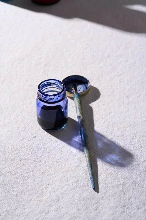
Rohrer & Klingner · Leipzig, DE · Est. 1892For the deep, matte blacks I letter with Rohrer & Klingner Zeichentusche, made in Leipzig by a house that has been cooking ink since 1892. I chose it over the convenient modern bottles because it is built the old way, a dense, shellac-bound drawing ink that sits down velvet-black and stays put, with none of the grey, plastic sheen the newer inks leave behind. It behaves like ink is supposed to behave.
For the warmer passages I keep their iron gall as well, the same brown-black chemistry that scribes used for the Torah and that monks used for their manuscripts, which Rohrer & Klingner still brew from the original recipe. It bites into the paper and darkens as it ages, so the work keeps changing quietly long after it leaves my desk. Two inks from one careful house, chosen because I trust them to outlast me.
02 — Paper
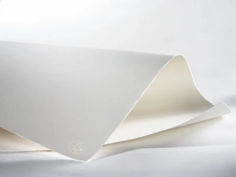
Hahnemühle · Dassel, DE · Est. 1584Everything begins on Hahnemühle paper. The mill has been pressing sheets in Dassel since 1584, older than almost anything else in the studio, older than most of the alphabets I letter in their European forms, and that kind of continuity is exactly why I chose it. A house that has made paper for more than four centuries knows how a sheet should age, and these are cotton-rag papers with no wood pulp and no acid, which is why letters from five hundred years ago are still legible while last year’s receipt has already faded.
I don’t keep just one of their papers but a range, because every piece asks for a different surface, a smooth, hard-sized sheet that lets a wet line sit without bleeding, or one with more tooth to drag the ink and rough up a stroke. Matching the script to the right Hahnemühle sheet is the first decision of every piece, and often the quietest.
03 — Nibs
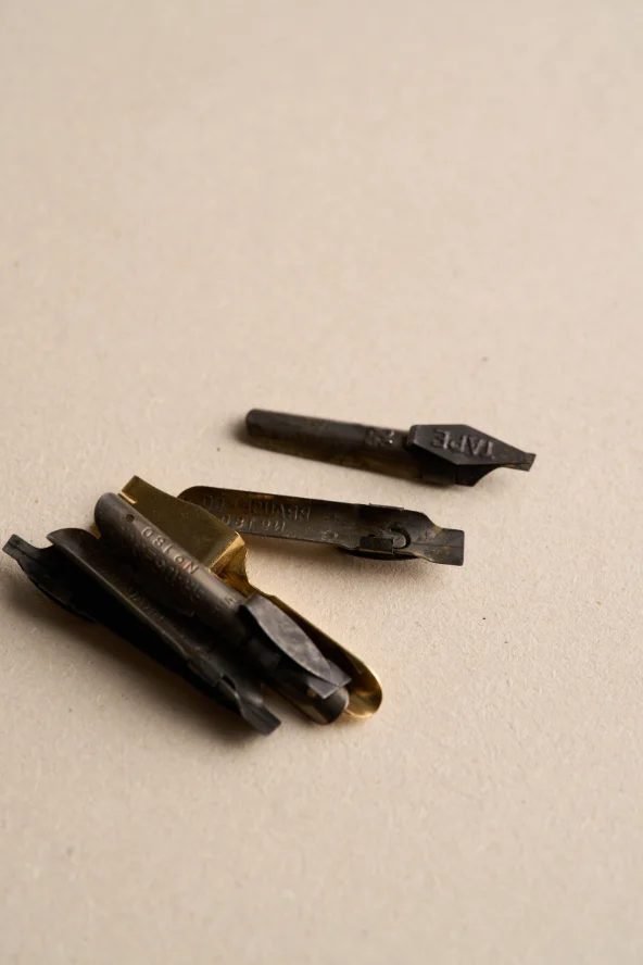
Brause · Iserlohn, DE · Est. 1850For the crisp, angular Hebrew hands I work with a flat-edged nib rather than a brush, and the ones in my drawer are Brause. They have been cutting nibs in Iserlohn, in the German steel country, since 1850, and that pedigree shows in the metal, a clean, springy edge that holds its width from the first stroke to the thousandth. I chose them because a square script lives or dies on the contrast between hairline and thick, and a Brause edge gives me that line every time.
I keep them in a range of widths so the proportion of a letter can be set by the tool rather than fought for by hand. Alongside the steel I still cut my own reed and quill for the oldest forms, a length of cane or a goose feather, sharpened with a knife and re-cut as it wears, because a reed lays ink a little drier and more alive, and some letters simply ask for it. The Brause carries the daily work; the reed is there for the letters that want their own history.
04 — Ruling pens
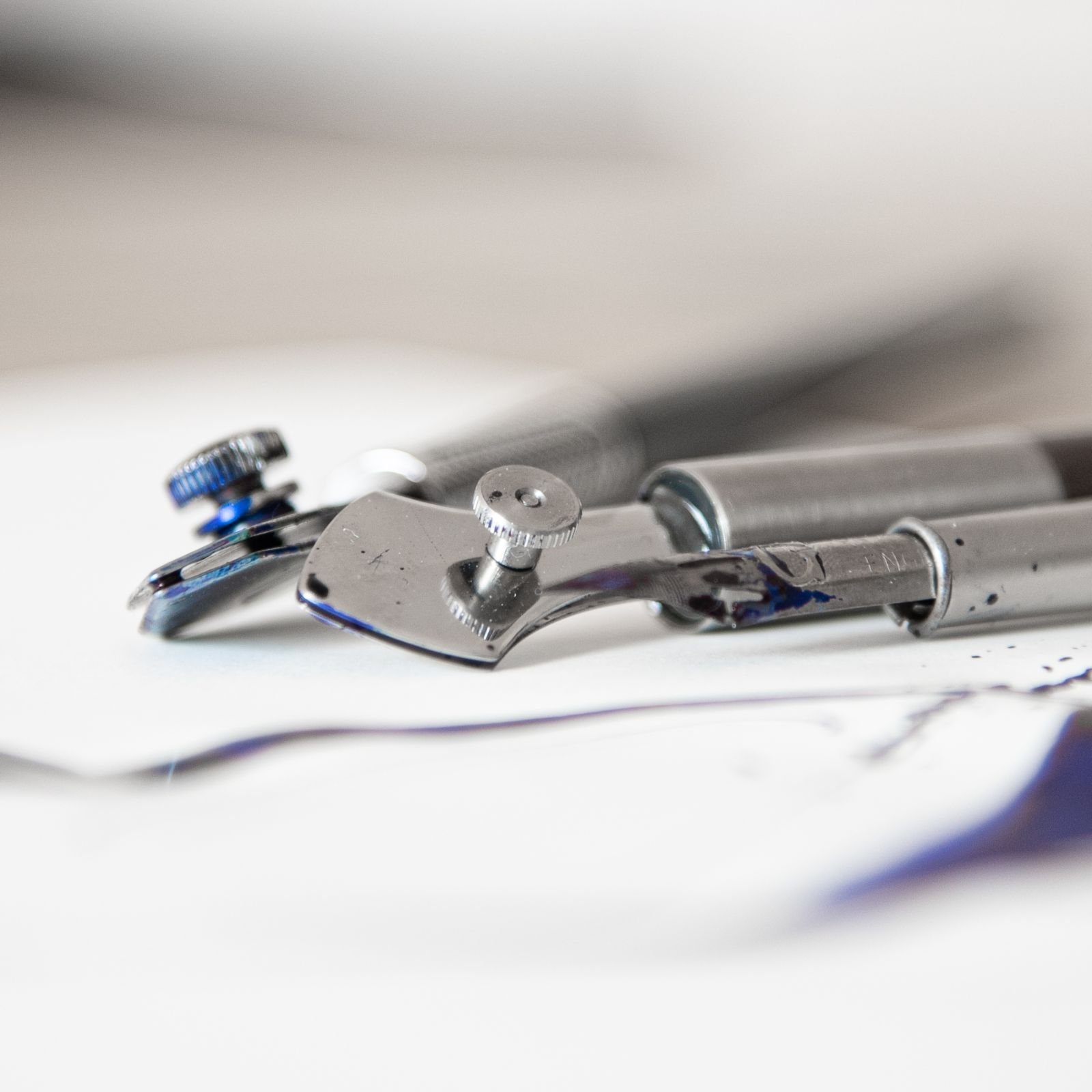
Dreaming Dogs · B. Neuenschwander · Curitiba BR · Bruges BEFor ruled lines and the loose, splashing strokes a broad nib cannot make, I work with ruling pens, a tool that began on the draughtsman’s table around 1800, drawing the crisp parallel lines of architectural and engineering plans for a century before calligraphers borrowed it in the 1990s and taught it to dance. Mine are hand-built in Curitiba, in southern Brazil, by Dreaming Dogs, a workshop that grew out of one professor’s pens for his students into tools calligraphers now order from across the world, each turned and fitted by hand so the steel meets exactly and carries a bead of ink the way the old drafting instruments did.
One of them was designed by my esteemed colleague Brody Neuenschwander, American-born, settled in Bruges, and among the finest letterers alive, the calligrapher behind Peter Greenaway’s films. His asymmetric pen is cut from Swedish steel and made up in Italy, so a single tool in my hand reaches from Flanders to Lombardy to Paraná. A pen shaped by someone who has spent a lifetime pushing the edge of the western letter carries that knowledge in its balance: it wants to move a certain way, and I have learned a great deal simply by following it.
05 — Brushes
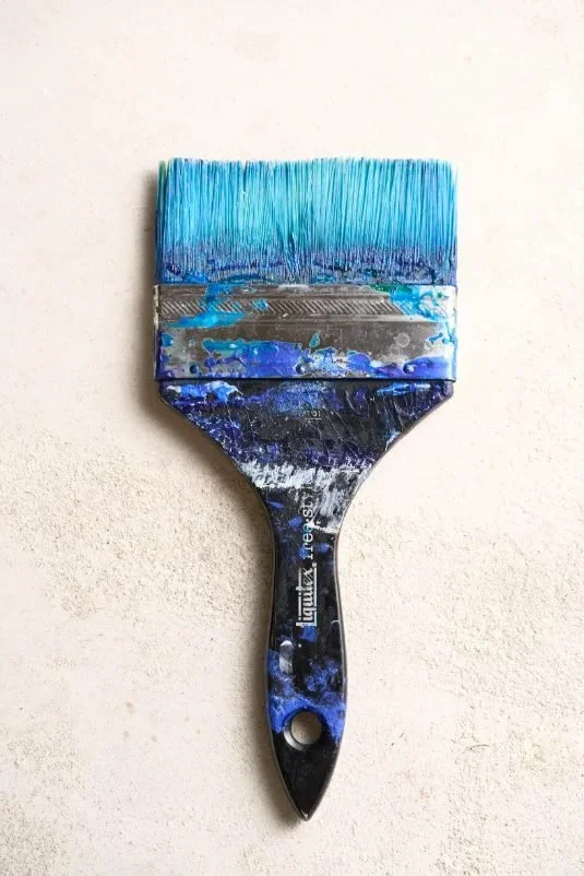
Liquitex · inherited · Est. 1950sNow and then, a tattoo design asks to be worked on canvas rather than skin. On those rare occasions, these are the materials I gladly turn to. For the larger works I use Liquitex Free Style brushes, the big, long-handled synthetics that were built for lettering and that muralists and street writers reach for when a stroke has to be made in one confident pull. I chose them deliberately: Liquitex were the people who put the first water-based acrylic on the market in the 1950s, so the brushes and the paint come from the same understanding of how the medium wants to move. They carry a huge load of colour and keep a clean edge across a sweep most brushes would feather out.
The fine work is done with a small family of brushes I inherited from my great-aunt, a painter herself. They are older than most of my clients, broken in over a lifetime that wasn’t mine, and they hold a point no new brush has ever matched for me. I wash them in cool water and stand them upright to dry, the way she did, and in return they have given me thousands of letters, her hand, in a sense, still steadying mine.
06 — Paint
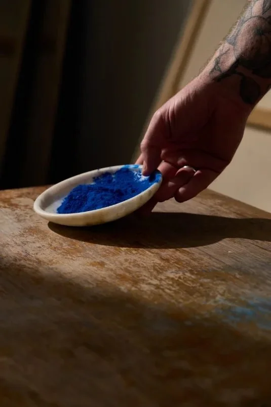
Kremer · Golden · Aichstetten DE · New Berlin NY USWhen a piece calls for colour, I don’t reach for a tube. I mix the paint myself. The pigment comes from Kremer, the German house that conservators turn to when they restore old masters, because Kremer still grinds the historic earths and minerals exactly as colourmakers did centuries ago. Choosing the raw pigment myself means I know precisely what is in the colour and that every particle of it is lightfast, so the hue you see now is the hue your grandchildren will see.
I bind it into a Golden acrylic medium, the line founded by Sam Golden, the man who helped formulate the very first artist acrylics in the 1940s, so the binder carries the whole short history of the medium in it. Mixing pigment and medium by hand lets me set the body and transparency of each colour myself and build a letter in thin, translucent layers, the way a calligrapher builds a stroke. Nothing in it will shift or yellow with the years, because I put nothing in it that would.
07 — Canvas
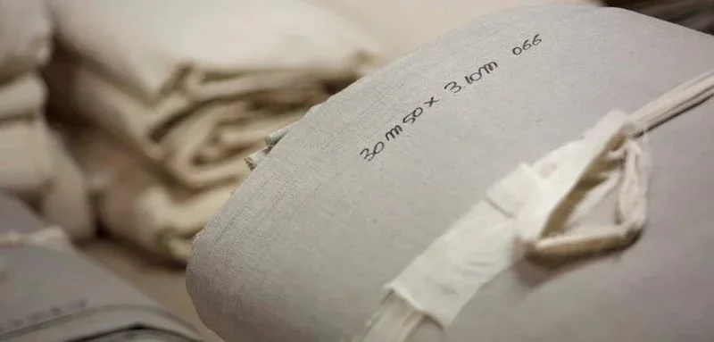
Claessens · Waregem, BE · Est. 1906For works that live on the wall rather than the page, I paint on Claessens linen, the cloth woven in Waregem, in West Flanders, since 1906, and the bolt most master painters mean when they simply say “Belgian linen.” I buy it raw and unprimed, a fine, close portrait-weight weave, because flax linen is stronger than cotton, moves less with the seasons, and Claessens spins it from European flax with so even a thread that a letterform sits on it without a fight.
I prime it myself, in thin coats, so the surface stays close to that famous weave rather than burying it under gesso. There is a reason the same mill has dressed canvases for over a century, painters keep coming back to it, and I would rather start every wall piece on the cloth that has already proven it can outlast the painting it carries.
08 — Wood
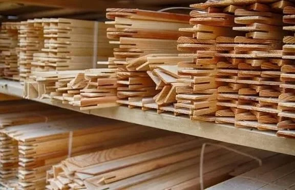
Cedar of Lebanon · E. Mediterranean · AntiquityThe linen is stretched over bars I have milled from cedar of Lebanon, the timber the ancient world reserved for the things meant to last. It is the wood Solomon brought down from the mountains for the Temple, the wood the Phoenicians built their ships from, prized for thousands of years because its own oils make it resistant to rot and insects without a drop of treatment. For work carrying Hebrew letters, I can think of no frame more fitting.
I have it kiln-dried and cut with the same mortise-and-tenon joints furniture makers have used for centuries, so the bars will not warp or twist as the years pass. The cedar keeps its faint, resinous scent for a lifetime, and a painting is only ever as straight and as lasting as the frame beneath it, so I treat the stretcher as part of the work rather than a fixture to hang it from.
09 — Primer
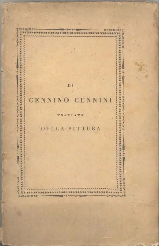
Cennini recipe · Kremer stock · Bologna chalk · 14th c.Before a single letter, the linen has to be sized and grounded, and I do it the way panel painters did it six hundred years ago, the recipe Cennino Cennini set down in his handbook around 1390. First a warm coat of rabbit-skin glue to seal the weave, then a true gesso built up in thin layers: fine gilders’ chalk from Bologna bound back into that same glue.
I prepare it by hand from Kremer’s conservation-grade chalk and glue rather than buying it ready in a tub, because a ground is not a neutral thing, it decides how the ink will sit, how the light comes back off the surface, and how the piece will hold up in a century. Made this way it can be sanded to the smoothness of bone or left with tooth, and it has already proven, on altarpieces older than any nation now alive, that it will not crack or yellow.